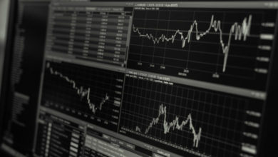
Candlestick charts are used to analyze past and present trends in asset prices and can be considered the heart of Technical Analysis. Candlestick charts enable the investor to observe patterns over a period of time and thereby analyze stock price trends and commodities such as silver, gold and even cryptocurrencies.
Candlestick charts were invented by a Japanese named Munehisa Homma in the 18th century. Initially, he used candlesticks to analyze rice prices. Later, there were people who applied candlestick charts to analyze indexes or other asset prices, such as stocks, gold, and silver by plotting the price or index into a candlestick chart. One candlestick shows the open, close, high and low prices of each specific timeframe we defined, such as 1 week, 1 day, 120 minutes, or other shorter or longer timeframe. When each candlestick displays sequentially, it will show us a pattern of price action over time.
The main advantage of using candlestick charts is to see past or current price trends whether it’s uptrend, downtrend or sideways. Some analysts use price pattern data to predict future price probabilities by using candlestick charts with various indicators, as well as finding the reversal pattern of the stock price. Most brokers have a software or web-based candlestick chart program for customers to use for free.
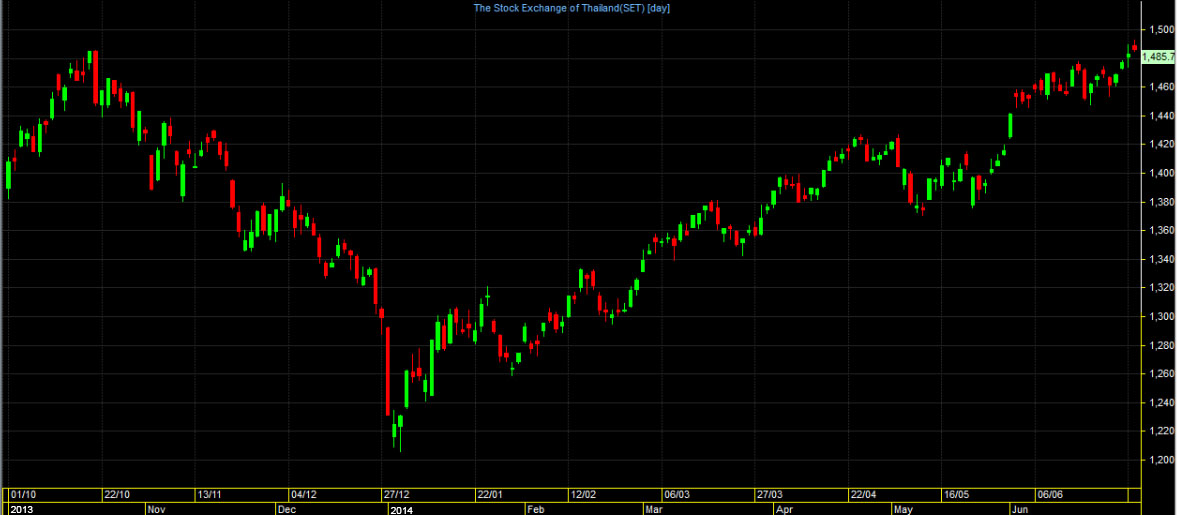
The following sample graph shows the SET index’s values for the period from October 2013 to June 2014 with the Time Frame set to Day (meaning that one candlestick shows the open, close, high and low price data which happens in one day). From the sample, even if we don’t have much knowledge about candlestick or technical analysis, we still can see from the picture that at the end of 2013, the SET index was downtrend. But the index ended its downtrend and started rising steadily since the beginning of 2014.
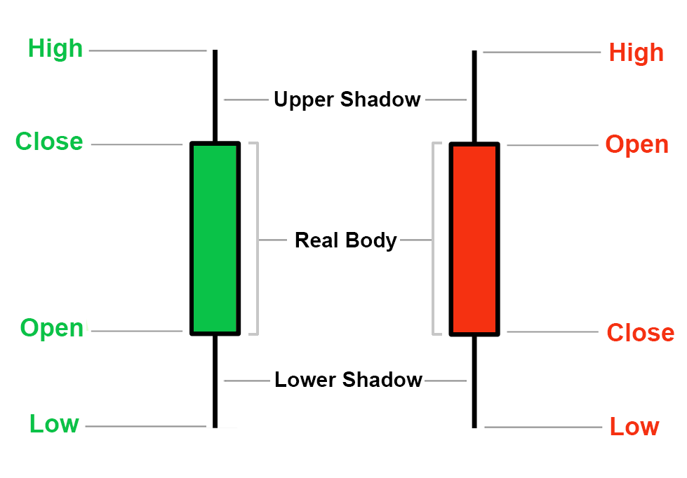
Let’s take a closer look at what one candlestick can tell us. See the sample picture below.
Open is the opening price, Close is the closing price, High is the highest price, Low is the lowest price, Upper Shadow is the upper candlewick area, Lower Shadow is the lower candlewick area, Real Body is the candlestick area.
If the closing price was higher than the opening price, the Real Body will be green color (some charting programs are represented by white or transparent bars), but if the closing price was lower than the opening price, the Real Body will be red (some charting programs are represented by black or solid color). In some cases, we won’t see the height of the Real Body (or see a hyphen instead) if the opening price was equal to the closing price.
Most candlestick analysis or technical analysis is done in conjunction with various indicators such as MACD, RSI, and Volume. One analysis technique is dragging the trend line at key points between candlestick to find support and resistance levels. Another technique is comparing the appearance of multiple candlestick group formations to facilitate trading decisions based on probability and on price reversal patterns. We will gradually introduce and explain these methods in the next article.
Before finishing this article, I would like everyone to try to open a charting program and select stocks or the products you want to trade then observe the formation of the candlesticks. You may see some of them have a very long candlewick. Some candlesticks have no candlewick at all. Try to observe how the opening, closing, maximum, minimum price of each bar affects how the shape of the candlestick changes. Try to set the Time Frame in many ways, for example, if we set the Time Frame to Day, we try to program the price from the beginning of last year to present. Or if we set the Time Frame to 60 Minutes, we can try to have the program show the price of the last two months. Observe the price fluctuation pattern. Try to see the formation of the bar from the end of the downtrend to the beginning of the uptrend, what does the formation of the candlesticks look like at the point of the reversal? Or vice versa, see where the uptrend ends up. And also notice when the price is moving in a narrow range for a long time.